Investing – Simple and Complex
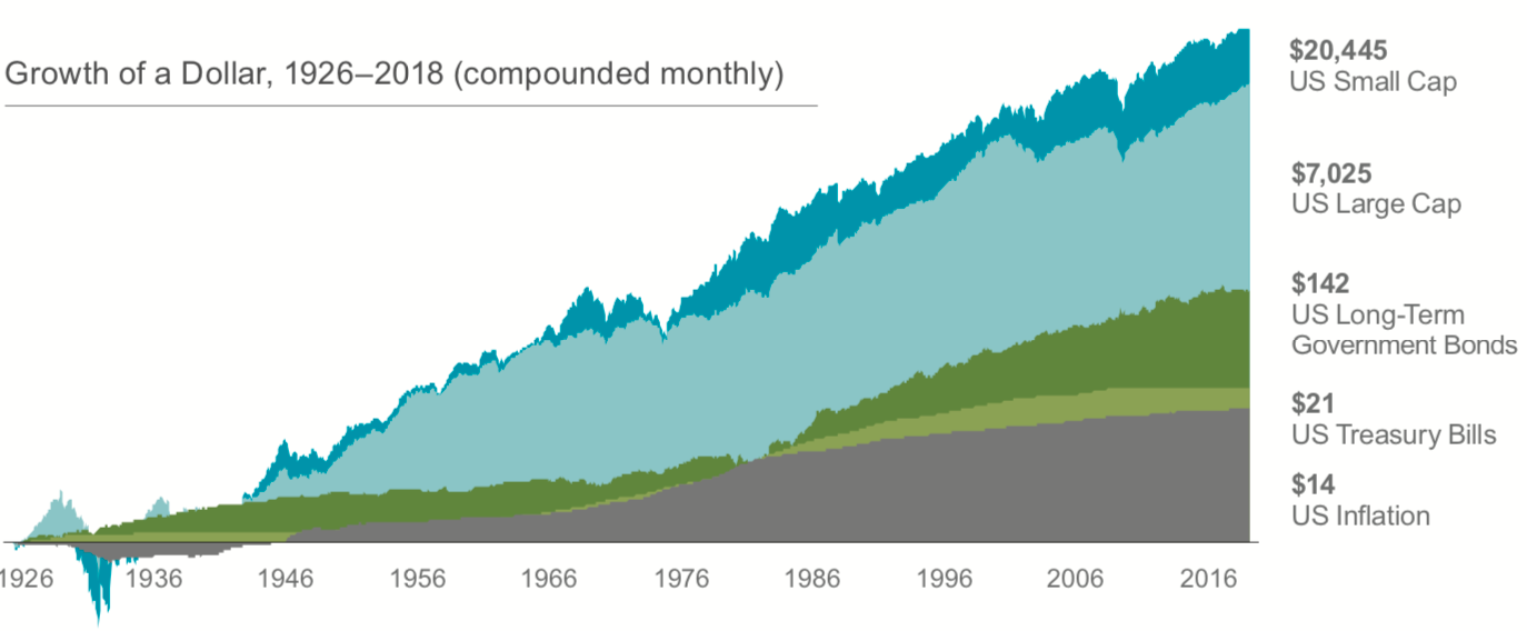
On paper, investing is simple – invest in a broad basket of stocks and over time you’re likely to achieve positive returns (historically speaking). Who hasn’t seen this chart before?
Source: Dimensional Fund Advisors
However, in practice, investing gets a little more complex when things like time-frame, objectives and preferences get factored in.
Emotional Rollercoaster
From there, matters get more complicated because we’re humans with complex emotions that can cause us to do crazy things, often defying logic. This emotional reaction defies the “buy low, sell high” method that is generally accepted as a sound investment strategy.
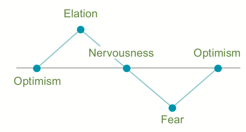
As depicted above, ample research has shown that investors tend to get over-confident when times are good and fearful when markets are down. This emotional reaction can often be caused by a lack of historical context and proper expectations.
Flaw of Averages
Tracking data is a good thing if done properly. Like lots of things worth improving, measuring yourself against a benchmark can help track your progress towards a goal. However, when it comes to tracking your investment success, the use of data and benchmarks can be a detriment to one’s success when done improperly.
When analyzing returns or making an assessment on the current state of the stock market, the natural thing to do is make snap judgements by comparing current returns to the historical average benchmark. However, as often is the case with investing, doing what feels right might not be in the best interest of the investor. Let’s take a look at some data.
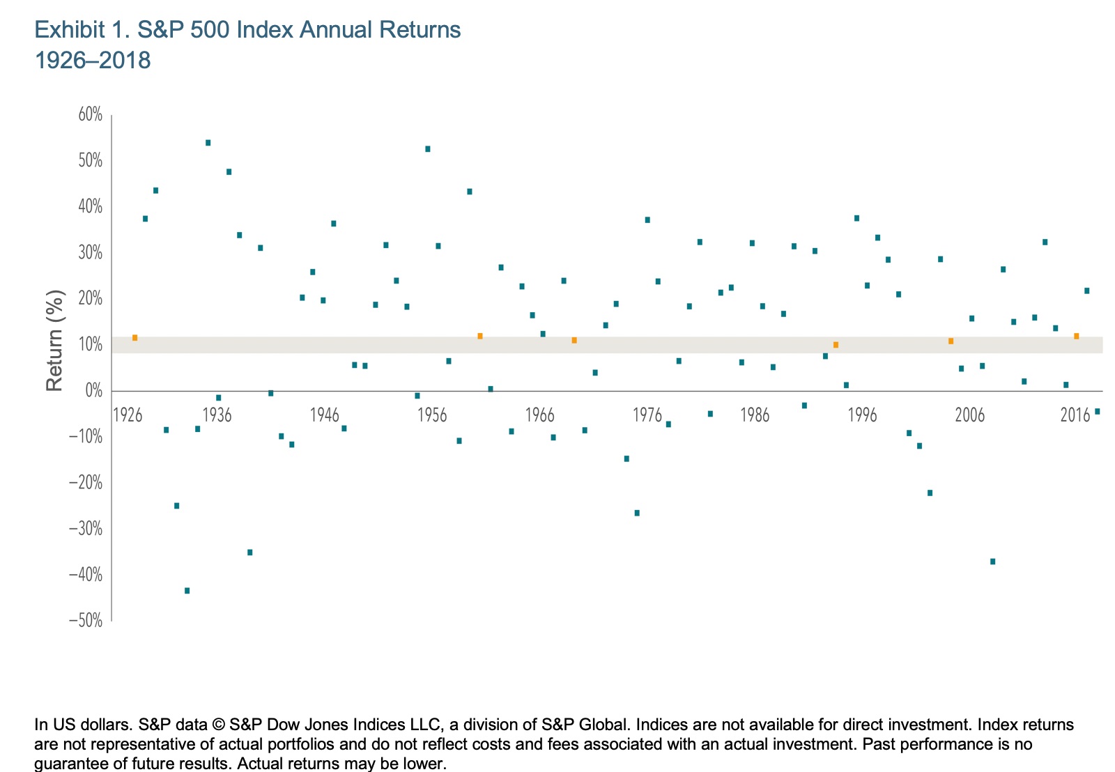
The S&P 500 Index is a commonly used investment benchmark that roughly tracks the largest 500 companies in the US. Because we have quality data going back to the 1920s, the S&P 500 is a good proxy for the stock market and used by many investors to benchmark against. Since its inception, the S&P 500 has an annualized return of roughly 10%. But is 10% the appropriate target? Let’s take a look at the data:
The chart below does a great job setting investors’ expectations by showcasing the entire range of returns over the last 90+ years. The shaded band marks the historical average (10%), plus or minus two percentage points (i.e. 8% to 12%). As you’ll see, only six (orange dots) in 93 years fell within that range.
Source: Dimensional Fund Advisors
Using the historical average for a benchmark can be dangerous. As depicted in the emotional rollercoaster chart earlier, calendar years when markets return above the average may lead investors to feel overconfident and take on more risk, ultimately derailing a sound strategy. And years when returns underperform the average can lead to the feeling of “something is wrong” causing investors to want “fix” something when the best action is to most likely to do nothing.
At best, investing like this will lead to a crummy experience, and at worse, material damage to an investor’s bottom line – positive returns. Don’t ride this rollercoaster. Get educated on the historical range of returns for your portfolio and make sure you’re comfortable with that range.
